Original post:
https://arcengames.com/announcing-in-case-of-emergency-release-raptor/
Did you know?
We're making a velociraptor game! Our first 3D game, in fact. The first of many.
In a nutshell: you get to be a velociraptor, fight robots, and navigate procedural levels.
I've been stalling on releasing videos or screenshots for weeks now, and I explained
in lots of detail recently what was going on with that. All of this has been on our forums, though, which is lower-visibility than the blog and social media, so that's rather short-sighted of me.
After all, obscurity is the big killer. I'd rather show too much too early and get blasted for a few things that are incomplete; waiting until things are polished to a sheen and then not having time for anyone to notice is worse.
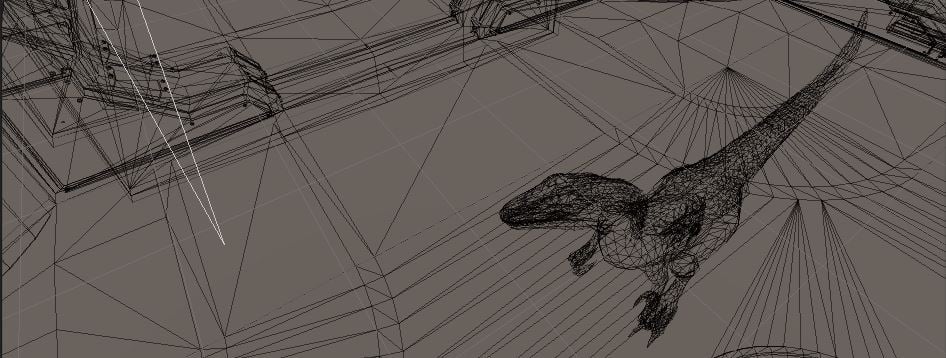
Unity Asset Store, The Right Way
Let's get this out of the way now. Yes, we're using the unity asset store for a variety of things. Does that mean we're not doing any coding, modeling, animation, texturing, or whatever on our own? No. I hate
asset store flippers as much as you do.
Also, when you get someone who just buys willy-nilly regardless of style and puts cartoon tigers in a "realistic" (but poorly-textured) town, chased by poorly-animated higher-textured models... yeah, I have a problem with that, too. It shows a real lack of artistry.
So what are
we doing, and why am I not ashamed of it? (Do I sound defensive? I guess I am. Sorry about that.)
- We're using models, textures, animations from the asset store.
- But we're also greatly improving a number of those.
- And we're making sure they actually make sense together.
- And we're doing unique ones of our own.
- We're using shaders and code from the asset store.
- But I'm going through with a scalpel and really editing the heck out of these to maximize performance, tune them to our specific needs, etc.
- In a lot of cases I'm buying several different solutions to the same problem, studying each one, learning from them, and then merging the best parts of them together. Or in a few cases just writing my own from scratch after seeing the various pros and cons.
- Most of these sorts of assets tend to have a lot to love, and then some other bits to love less, and having the know-how to go in and resolve those things is important. Otherwise you wind up with an unoptimized hot mess.
- It's also worth noting that the whole "not invented here, so I'll reinvent the wheel" attitude that some developers have can lead to unoptimized, poorly-tested hot messes, too. So taking a mix of the two approaches and just using common sense about it is by far the best technique in my opinion.
- In general if we buy some code, I'm expecting to have to change a minimum of 5% of it if it's just absolutely pristine (by general-purpose-asset standards), and potentially as much as 80% of it if it's a weaker asset. Why buy it, then? Because that 20% can be darn clever and something I'd never have thought of. Each programmer has their special strengths.
Deep Breath On My Part -- Our First Screenshot
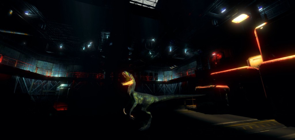
With all that said, here's our first screenshot:
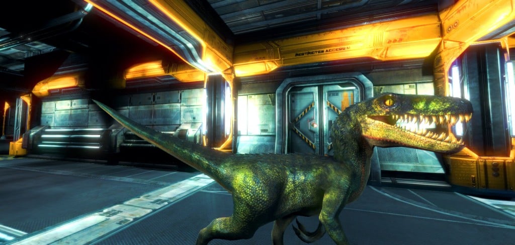
I'll save you the time of sourcing assets from that shot. The Raptor is this one, by
3dFoin. The environment that is shown is the exact demo scene from
SciFi Industrial Level Kit by Ximo Catala.
The fact that this is in the demo scene from that set is the big reason I've been avoiding showing screenshots yet. We're going to be making our own procedural levels, and will have assets of our own as well as those from a number of asset store assets, so it pains me to show you this in a demo environment that might give the wrong impression.
So it goes. Even in that demo scene, though, a ton has been changed. The lights have been reworked substantially in order to reduce the draw count a crazy amount. The materials have been tuned a lot, and made to work well in deferred rendering, linear lighting, and with the specific post-processing effects we're using. I'm not done hand-tuning all that yet, but it's coming along well. The colliders and physics for all objects have been redone from scratch as well, and the particle fields that are shown here are something we'll be replacing with something more draw-call-efficient. The walls are all things we're keeping the textures from, but making our own models for (lower poly, more flexible, a variety of other improvements). We're about 30% of the way done with the new walls, but those aren't shown here.
Raptor Diary: April 14th, 2016
This is something I'm going to start doing, so people can follow development. It won't be every day, but I'll try to keep it pretty frequent. I want to give you some good video, but I really want to have our own procedural environments before I do that.
Procedural Generation For Levels
I've decided not to work on that today or yesterday, because I want to get the individual pieces working better. ProcGen is already pretty decent in the main, thanks to
DunGen as a base, but there is a LOT of customization and extension I need to make to what is already a really flexible product.
Incidentally, I spent loads of time a month or so back looking at various dungeon generator and city generator components, and bought a number of them to experiment in their code, and this is the only one I was really that happy with.
Good grief please understand this is a debugging type of shot from the procgen:
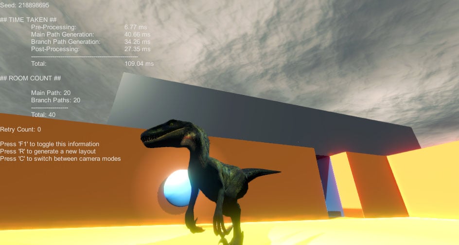
I figure it's fun to show you before and after shots. That's the before, and I'll show you the after shot next week or the week after.
Raptor Animations
Blue is working away on these, for the moment mostly using
Skele. That said, she's running into some severe limitations with that in terms of trying to make realistic animations for walk cycles in particular. I don't like the prefab animations that came with the raptor model we purchased, so we've been working on redoing absolutely all of them. We started with some new attacks (bite, kick, tail swipe), and have a few others to do (hand claw swipe), and a few that are partially done (crouch, lunge).
The interesting thing has been using animation layers and really blending all of these together, etc. For things like the bites, we actually have 6 separate bite animations and it chooses between them at random. The hitbox of the raptor's head is very precise (although exaggerated), so it moves as you'd expect with how the motion of the animation moves. Very cool. Same deal with the tail swipe, although I have the hitboxes extendfar below the tail in this case, because otherwise you so easily miss on-the-ground targets with your swipe.
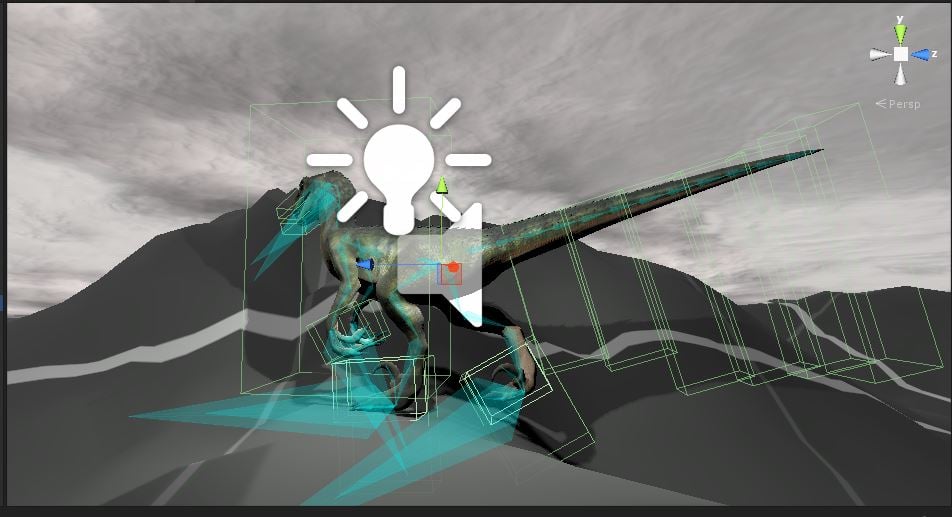
The above shows some of the hitboxes, which toggle on and off for various reasons at various points. The physics layers setup that I've designed is super cool, if I do say so. Bloody efficient and effective. Bear in mind that's obviously another test scene shot, and also a Scene View from the unity editor, rather than one with proper effects, etc.
At any rate, Blue was having trouble getting the animations to import properly into
Maya LT a few weeks ago, but she's going to return to that and experiment some more today, since she's having limitation issues with Skele. After that hopefully we'll have a new run and walk animation set, a longer idle animation (what is there now is good, but repeats after about 5 seconds).
Then adding more attack variants, and making the existing elements look better, blend from state to state better, and so on. It's a lengthy process to animate a character like this so fully and make them feel awesome and organic rather than like some brick that you steer around the level. ;)
Logo? What Logo?
Yeah, no logo yet. Picture something awesome right here for the logo. Man it's epic, isn't it? ;) Or at least passable.
Sound Effects
I haven't started work on this yet, but I'm really itching to. I have huuuuuge sound libraries at this point (well over 100k sounds), and a lot of great animal sounds in them, among other things. Not only am I excited about putting in great sound for the raptor, but I'm also looking forward to really having detailed sound design on movable objects that collide with one another, too. When the raptor kicks a box over and it slides along the floor, it should make a noise, etc.
 Post-Processing
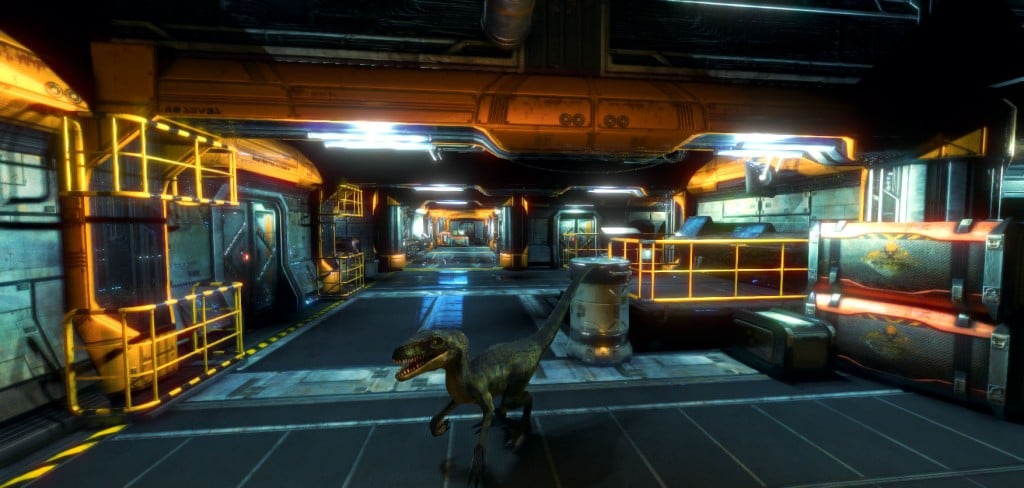
All of the effects that make these scenes look so great are achieved with
Screen Space Reflections (SSR) by Plawius,
Scion - Filmic Post Processing by Jove Software (with some customization on this one, and mainly focused on depth of field and then using a LUT for color correction), the Blockbuster 2 LUT from the
Amplify LUT Pack (but then heavily modified to get my exact desired effect),
Amplify Bloom with a lot of painstaking tuning,
Horizon Based Ambient Occlusion by Michaël Jimenez with surprisingly little required tuning (same as the SSR solution), and then -- for now -- DLAA antialiasing from unity themselves.
I've experimented with about 8 other products, customized many of them, profiled them for performance, and so on, iteratively for the last month or so. The above is the result of that.
You'll notice that the lighting isn't right on that scene directly above, though, because it's super dark in that one big room. That was partly because the original demo scene was making use of a directional light and then shadow casters, which I didn't like at all. So I'm working entirely off of point and spot lights, and since it's a demo scene I just didn't bother to re-light the center of that room properly. A lot of the lighting in these scenes is non-ideal at the moment because they aren't in levels that have been hand-crafted for the post-processing I'm using.
They're
close to what I want, but the final lighting will look better. And perform better -- though I will say, I've already quadrupled the frame rate (currently to 150fps on average on my 980M) in the demo scene, which isn't really optimized for my needs at all.
 Destruction!
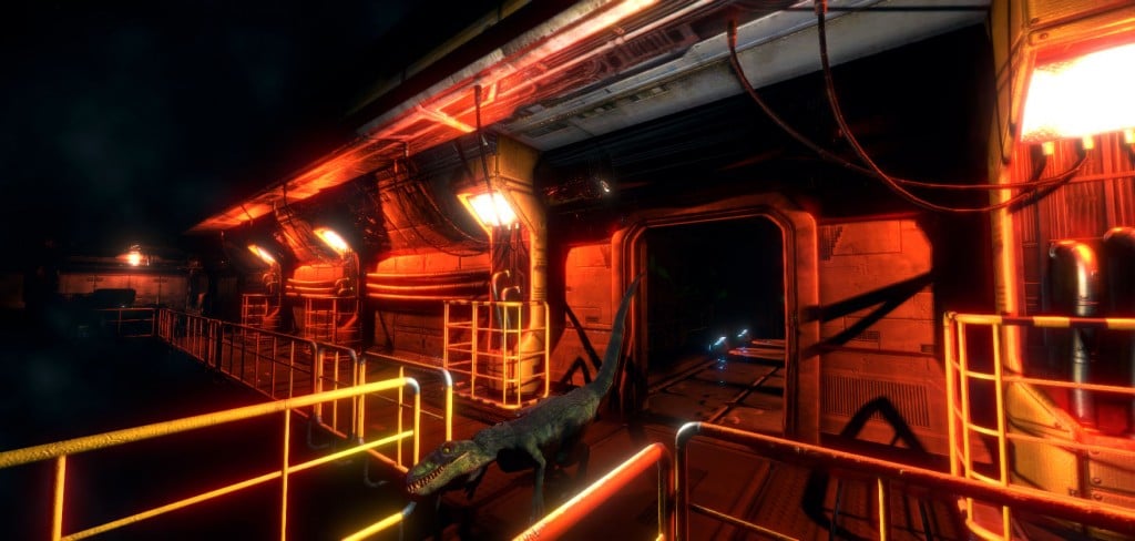
One of my big goals has been to have really fun destruction in this game. Right now you can kick over crates and barrels and so forth and that can be great fun. But I want to be able to break them apart as well, which will lead into being able to do the same sort of thing to enemies, too. So that's the current task I'm working on.
It's trickier than you might think to do it right, in a way that is efficient and meets all my requirements. I'm having to pull bits from three different destruction tools, as well as coding quite a bit myself.
Exploder by Reindeer Games is really cool, and it handles all types of meshes really well. However, it only supports completely shattering objects, not chipping off pieces. Still, there's a lot in there in the pooling department in particular that I like. Originally I was going to pull that code directly and adapt it, but that was proving to be too much of a pain and so instead I'm just recreating my own version.
DestroyIt - Destruction System by ModelShark Studio is excellent in so many respects, and I learned a lot from studying their pooling, too. They also made an excellent shader for progressive damage masks, which I may or may not use (it may be redundant in my case). The big issue here is that they also don't really support partial object destruction unless they are separate GameObjects, and they don't have their own fracture algorithms in place, unlike the other solutions. But I learned a lot here.
To my surprise, the core of what I'm doing actually comes from
DinoFracture - A Dynamic Fracture Library by Fat Cat Games. At a glance this seems almost abandoned as a project, and not well supported. It also does no pooling of fragments at all, which is super annoying. There are some other annoyances and messiness, too, and their presentation on the asset store is the least professional. That said, they have a very fast fracture algorithm, and support partial destruction of objects, and have a lot of cleverness going on in there. And I don't really need support. So I took the plunge, and their code is actually really good and clean. Some of it is in a dll, which bugs me, but I'll live.
I'm going to spend the rest of my day coding and testing custom pooling for DinoFracture, combining and stripping a number of their scripts for efficiency, and then implementing that on the various objects. Hopefully I can get all of that done today, but realistically it might take me into tomorrow.
 Other Object Assets
After I get things working well with destruction, then it's on to getting some more assets set up. The ones I've chosen to work with next are
Lab interior pack by Silver, and
Sci Fi PBR Level Kit / Space Station / Modular Interior Kit by PM assets.
The former of those is meant to be a different level of the complex that the raptor is in during the first areas of the game, so the style is a bit different than the industrial areas on purpose. However, the overall feel of it will be brought MUCH closer to the visual style of what we have so far before it's in the game "for real."
The second asset pack I got mostly for some of the objects, which again will need some altering on their textures and so forth to fully fit, but they have some great models in there.
I'm then going to be pulling in
Abandoned Factory by Modular 3D, which you probably think doesn't fit the visual style of this game at all. You're absolutely right! :) But that's mostly a texturing thing, and I look forward to seeing if you can even spot these assets in the final levels once we're done with them.
Martian Base by Illia is up next after that, and overall needs the fewest changes, although the entire color scheme is going to be shifted super heavily. It will make for excellent accents in the current industrial areas, as well as a great transition to the lab areas.
All the processing of those four other packages will take a solid two or three days for me, and then even longer for Blue when it comes to the new models she creates using their textures, etc, so I won't be trying to do full integration from them right at the start, not by a long shot. There's still at least a week of work left the existing industrial set on Blue's end, for goodness sake. So I'll just pulling the most essential bits to start with.
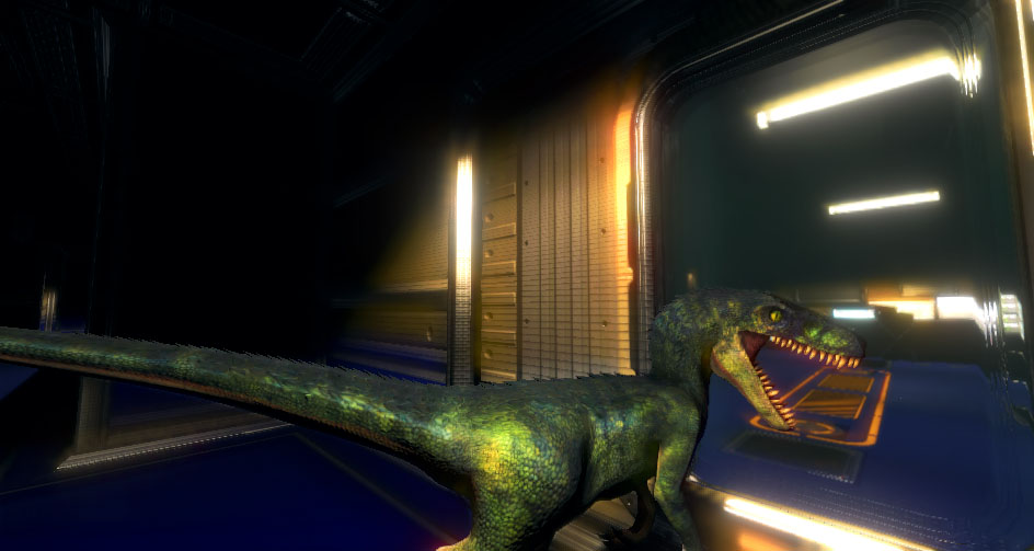
The above is the raptor in the Lab interior pack demo scene without any alterations made yet. As you can probably tell, it's going to need a lot of work -- but then again, for being just a drop-in so far it actually isn't THAT bad. The post processing helps a lot in tying things together. Still would make me absolutely cringe to see it like this in the final game, though.
Beyond
After I get the new assets fixed up, or at least some of them, then I'll have enough to really start getting into the first rudimentary dungeons with DunGen, and then start changing the code of that around a lot as much as need be. Then comes the first video of the game in action, the sound effects, then enemies, etc.
Enemies???
Oh right! Yeah, I've hardly mentioned those. You fight against robots and other machines. Some big, some small. Some are more humanoid and you can pounce on them, whereas others are much larger and you can dismantle them piece-by-piece. I'm very excited about it, and I've been doing a lot of prep work for that.
But one thing at a time. My big priorities first have been making the raptor itself feel awesome to control, making it have environment traversal that is fun, getting the environments to be something we can procedurally create in an efficient way, and then the underlying destruction framework that is for both props as well as enemies. Full enemy design derives from those other areas in the case of this game.
Stay tuned -- and thanks for reading!