The
release notes are fairly lengthy, but mainly because they go into a lot of detail. There's a lot of cool stuff in here, but nothing like the last release in terms of scale.
Keith added a couple of buttosn and menu commands to make things easier on players, and extended part of the modding interface to make things easier on visually-oriented modders.
On my end I cleaned up some various things related to the icon graphics, along with Blue doing the same. I also made some adjustments to the overall bloom effects; it should be better-looking and more performant now. Wormholes should also be better-looking.
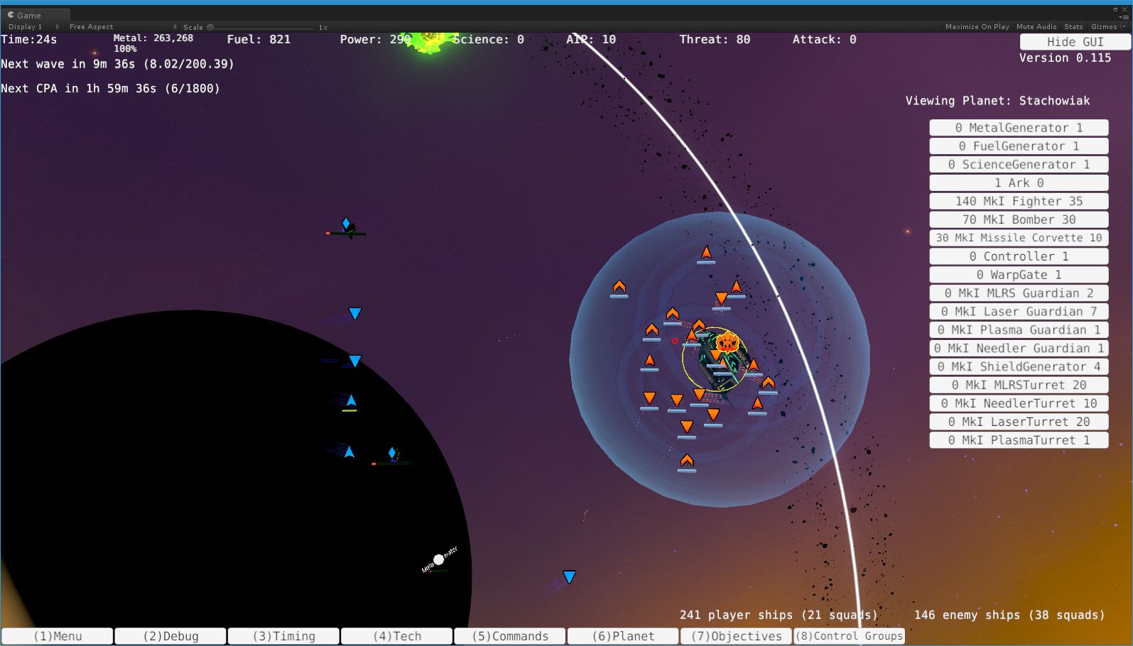
Most of my time on this one was spent on the icons themselves, though. Both in terms of making the new system look better than it did before, but also allowing for a two-version system for players to choose between (in the settings file only right now, sorry about that). Basically the ability to see everything represented with shapes, along the lines of this:

Instead of ship-oriented (with flair for sub-types) icons like this:

Even in the latter image, you can see a lot of the various improvements, though. The icons have more definition to them, the borders and bars are better, and so on. Frankly I'm not sure which system I completely prefer, but fortunately we don't really have to choose between them. Hooray options menus! ;)
Cheers,
Chris