Author Topic: AI War 2 Alpha v0.114 "Major GUI And Icons Overhaul" FINALLY released!  (Read 8902 times)

Offline x4000

  • Chris McElligott Park, Arcen Founder and Lead Dev
  • Arcen Staff
  • Zenith Council Member Mark III
  • *****
  • Posts: 31,651
Chris here.  This is the largest single release we've done since starting the alpha with folks, and by a fair margin.  The release notes are nuts, but worth a read.

That said, right off the bat: "seriously Chris??  TWO WEEKS since the last build for the game?"  Don't worry, that's not something we're going to turn into a habit.  In addition to simply packing this one with stuff, we also had that recent hacking attempt against us which slowed us down a tad, and some personal life things outside of our control.  But the biggest slowdown, by far, was the new icon system kicking my butt again and again.

Movie poster: "And then his butt... kicked back."

(Wait, that's not right.)


Icons!

At any rate, the icon system that is now in place is an in-progress version that has resulted from a lot of experimentation on my own part, along with experimentation by Blue, as well as lots and lots of discussion from players.

Note that I'm locking the original topic about icons, and I'd like to have a new discussion that starts from the common baseline of what is in 0.114.  I'm reasonably pleased with what is here, although the flair in particularly could look a little more visually polished.

Overall there are some polish things that need to happen with several areas of the icons, but in a generalized sense I think the core goals of showing clarity and yet not being cluttered is working well?  Before we get into polishing things like the flair too much, we want to make sure that we're on the right path here.

The good news is that if we want to shift around what pieces of icon are where, it's now something that I can do with some trivial code (or in some cases just xml).

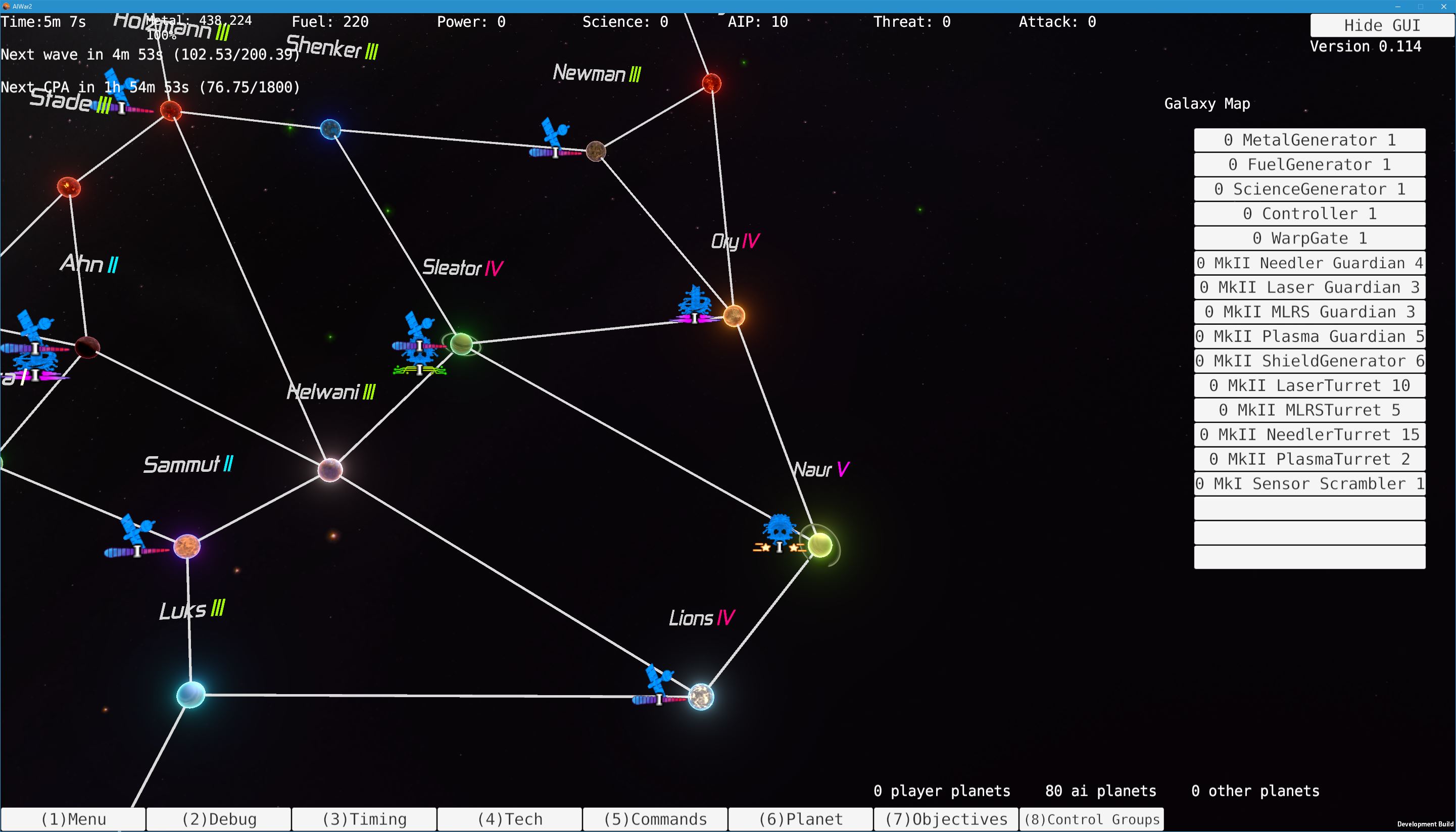
The short explanation of these:

  • You can now see what a ship is via a combination of a central player-color icon and (sometimes) a non-player-color "flair" under it.

  • You can see the health for squads under them.

  • The mark level is still shown below them, but is done in a sprite fashion now.  And the color of the mark level on the squad shows its action status (Free Roaming Defender, etc).

  • If it's under a forcefield or cloaked, then the mark level gets an additional glow around it to show that.  It's subtle, but helpful.

  • If the squad is selected or mouseovered, then the main player-colored-icon part gets a border.


GUI!

Keith has been doing a ton of work on the GUI, adding in new menus and generally making things more-sane.  It's still all temp graphics and so on, but the idea is to get the usability higher, which I think is very much happening there.

Another big thing that he has been working on with this is an Objectives window, which is inwork still (naturally), but is something I believe he wants to have a pretty major role in the game later on.  A lack of direction was something that was the biggest stumper for new players in Classic, even those that got through the tutorials.

The idea is to help solve that via the Objectives window, as well as making that useful for veteran players to check some intel (via what objectives are available for them).  At least, that's my understanding -- don't hold us to that.  Keith can explain it better, as it's his brainchild and I'm probably misrepresenting that bit by accident. ;)


Other Stuff

Oh man, it's been so long I can't believe some of the stuff that is in this build.  These were forever ago, but they're just coming out now.  In no particular order:

  • Keith fixed a bunch of bugs, and I fixed a few.

  • We did a lot of internal work on our release process, to make releases easier and more reliable.  AND to make it so that hopefully we can remove files from the steam builds, which is useful for the external modding project that comes with the game.  (Keith, don't forget to check that worked for you).

  • Some more work has been done to improve functionality in the custom LODs that I created for the game.  Although there's a central problem with it right now that is causing them to not calculate their distances properly.  So it's putting a lot of extra load on the GPU now compared to what it will next build.

  • The wormhole graphics have gone through like four more iterations, heh.  They're a lot less neon now, and more attractive and more efficient.

  • If you're playing on a non-US-English OS (linux or otherwise), the game should now work properly for you.

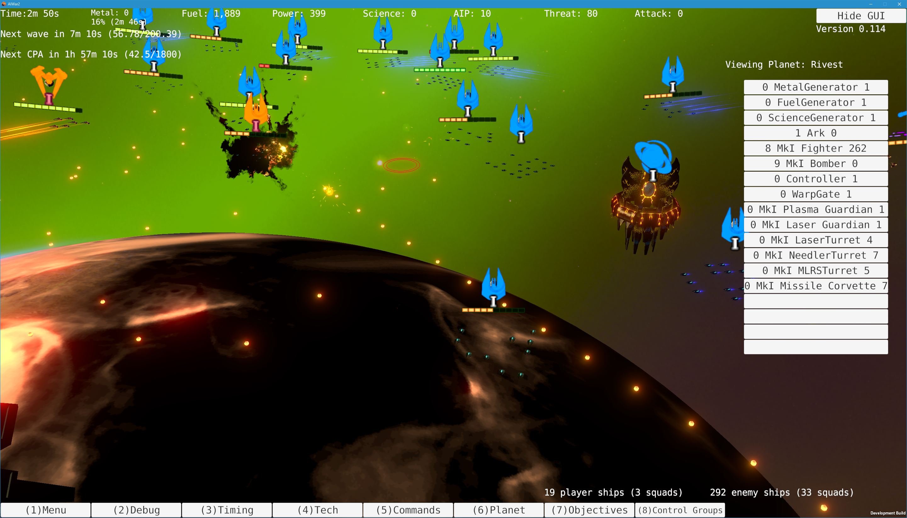
  • You can hold Z to see the range of ships, or shift to show the orders your ships have.  I'm already aware of an error in the display of your ships' orders when they're headed for a wormhole.

  • The cursor on the gamefield plane is now a lot more attractive and clear.


It's been a really stressful couple of weeks for me, but I'm really happy with the end result.  Expect much more rapid releases coming up next week -- although for now I'm off for the weekend, heh.  Looking forward to relaxing a bit.

Just in case there's some major issue in this build that prevents you from playing, there's a new beta branch in Steam for the older 0.113 build of the game.  You can revert to that if you want to play it for whatever reason, anyhow -- hopefully the new build is far preferable on all fronts, though.  Knock on wood! :)

Cheers,

Chris

Have ideas or bug reports for one of our games?  Mantis for Suggestions and Bug Reports. Thanks for helping to make our games better!

Offline WolfWhiteFire

  • Full Member Mark II
  • ***
  • Posts: 195
Aren't those screenshots a bit excessively big?

Offline gavin144

  • Newbie
  • *
  • Posts: 9
Only had time to boot up the new version for a few minutes. I really like how the new icons are coming along, much clearer while giving more information. I think the new wormhole animation should probably be slowed down again a bit... but others may disagree. I also couldn't figure out how to access build menus to place buildings/create build queues. But I didn't have long, and may have just been stupid.

Offline RabidSanity

  • Newbie Mark II
  • *
  • Posts: 23
The build menus are under the Commands menu option.  Took me a few clicks to find.

Offline RabidSanity

  • Newbie Mark II
  • *
  • Posts: 23
Is it possible to handle the wormhole names under the new icon system?  Perhaps the two mantis issues I opened regarding difficulty reading the names on a bright background(0019056) and how the wormhole names don't rotate when you rotate your view(0019057) can be easily fixed with it.

Offline NichG

  • Full Member
  • ***
  • Posts: 125
I find it much easier to tell what's going on with this version of the icons! I do think the readability could be improved a bit more just by thickening the borders of the icon glyphs with a darker shade of the same color. That way, when you have a pile of multiple icons they remain a bit more distinct. Sort of like how right now, when you select them, you get a white border; if the unselected state had a slightly dimmed orange/blue border rather than just having a single color, I think that would help somewhat.

Offline BadgerBadger

  • Arcen Volunteer
  • Hero Member Mark III
  • *****
  • Posts: 1,229
  • BadgerBadgerBadgerBadger
It looks amazing! It's a wonderful improvement over what we had before, and I am a huge fan. I'm sure I'll have useful feedback going forward, but the icons look wonderful as a first pass.

Offline kasnavada

  • Hero Member Mark II
  • *****
  • Posts: 986
It's an improvement on what was before...

But the icons are still "too uniform" and bright, frankly, on the black background my eyes water a bit when I try to make out details. Is there any planned changes to make the icons less uniform ? The main issues I have with this is that when I zoom out it just looks like a big gold blob. The "selected" icon from NichG would be a huge improvements but some "shading" or contrasts outlining shapes in the icon themselves could do the trick even better.

:)

Offline eRe4s3r

  • Core Member Mark II
  • *****
  • Posts: 2,825
Eh, seeing this, I definitely want non-shaped colored blips now as an option more than ever....  and a proper sidebar as detailed in THAT topic ;p

Ps.: Posting this just threw me back into the index of the forum.
Proud member of the Initiative for Bigger Weapons EV. - Bringer of Additive Blended Doom - Vote for Lore, get free cookie

Offline keith.lamothe

  • Arcen Games Staff
  • Arcen Staff
  • Zenith Council Member Mark III
  • *****
  • Posts: 19,505
Eh, seeing this, I definitely want non-shaped colored blips now as an option more than ever....  and a proper sidebar as detailed in THAT topic ;p
Which of the sidebar mocks in that thread would you want to see first? Or would it be a different one, now?
Have ideas or bug reports for one of our games? Mantis for Suggestions and Bug Reports. Thanks for helping to make our games better!

Offline Cyborg

  • Master Member Mark III
  • *****
  • Posts: 1,957
Re: AI War 2 Alpha v0.114 "Major GUI And Icons Overhaul" FINALLY released!
« Reply #10 on: April 01, 2017, 12:56:01 pm »
Big improvement, great work here. The bright green neon wormhole could be toned down a bit. The interface is now easier to work with. I agree about the sidebar, can't wait to see that coming soon.
Kahuna strategy guide:
http://www.arcengames.com/forums/index.php/topic,13369.0.html

Suggestions, bugs? Don't be lazy, give back:
http://www.arcengames.com/mantisbt/

Planetcracker. Believe it.

The stigma of hunger. http://wayw.re/Vi12BK

Offline Chthon

  • Sr. Member Mark II
  • ****
  • Posts: 398
Re: AI War 2 Alpha v0.114 "Major GUI And Icons Overhaul" FINALLY released!
« Reply #11 on: April 01, 2017, 08:13:43 pm »
Eh, seeing this, I definitely want non-shaped colored blips now as an option more than ever....  and a proper sidebar as detailed in THAT topic ;p
Which of the sidebar mocks in that thread would you want to see first? Or would it be a different one, now?
I would definitely want to see options that we can customize to our own tastes. E.g. for the person who thought AI War had a good sidebar (not me mind you), and one for someone like me who would like to see ships grouped up like Bombers: Me# Friend# Enemy# in one row, so I don't have to hunt for the particular bomber that is mine, I can look for bombers once, and see immediately which is mine.

Offline eRe4s3r

  • Core Member Mark II
  • *****
  • Posts: 2,825
Re: AI War 2 Alpha v0.114 "Major GUI And Icons Overhaul" FINALLY released!
« Reply #12 on: April 01, 2017, 10:47:03 pm »
Eh, seeing this, I definitely want non-shaped colored blips now as an option more than ever....  and a proper sidebar as detailed in THAT topic ;p
Which of the sidebar mocks in that thread would you want to see first? Or would it be a different one, now?

Start with Sins of a Solar Empire sidebar functionality adapted to MK concept and then we can go from there? ;P Condense/Expand/filter/pin functionality, and on the right side a "Priority" bar that lists (user) pinned high priority targets, and which is synced in COOP and has, if the game is COOP and only then, sync commands and order function on right click (avoid/attack/capture) etc.

The barest functionality needs to be there to see how it works in practice and everything else is modular expansion and feature adding. Specifically what Chthon wrote could be an interesting optional way to sort in the sidebar but for general use in combat that'd probably not be useful. Point being, as long as we can change order and sorting of the sidebar, with user created XML files that can be loaded in-game for example, a sidebar will be one of the most powerful tools in the entire game.

Also I would still be for making sprites for the sidebar and blips but I am not sure that's even still an option... making blips look like blips in your method of icon creation sounds really wonky. I wouldn't even know how to do that, since blip and sidebar icons need a black outline.....
Proud member of the Initiative for Bigger Weapons EV. - Bringer of Additive Blended Doom - Vote for Lore, get free cookie

Offline keith.lamothe

  • Arcen Games Staff
  • Arcen Staff
  • Zenith Council Member Mark III
  • *****
  • Posts: 19,505
Re: AI War 2 Alpha v0.114 "Major GUI And Icons Overhaul" FINALLY released!
« Reply #13 on: April 02, 2017, 07:46:27 am »
Also I would still be for making sprites for the sidebar and blips but I am not sure that's even still an option... making blips look like blips in your method of icon creation sounds really wonky. I wouldn't even know how to do that, since blip and sidebar icons need a black outline.....
Gotta run so I can't reply to everything else just yet, but on the blips it should be quite doable; I've currently got this mod in progress (screenshot attached, built using only those tools available to modders). Working on optional suppression of the mark level icons, too, though that brings up other questions on how to show certain things (or if).

Are those still too big?

Have ideas or bug reports for one of our games? Mantis for Suggestions and Bug Reports. Thanks for helping to make our games better!

Offline eRe4s3r

  • Core Member Mark II
  • *****
  • Posts: 2,825
Re: AI War 2 Alpha v0.114 "Major GUI And Icons Overhaul" FINALLY released!
« Reply #14 on: April 02, 2017, 09:36:14 am »
Also I would still be for making sprites for the sidebar and blips but I am not sure that's even still an option... making blips look like blips in your method of icon creation sounds really wonky. I wouldn't even know how to do that, since blip and sidebar icons need a black outline.....
Gotta run so I can't reply to everything else just yet, but on the blips it should be quite doable; I've currently got this mod in progress (screenshot attached, built using only those tools available to modders). Working on optional suppression of the mark level icons, too, though that brings up other questions on how to show certain things (or if).

Are those still too big?

Maybe by 2 or 3 pixels, they really need flat shading, subdued colors if unselected, and a clean constant black outline though. If the shader does that, and you show us how we can mod this, then you can let us do this once the beta releases and once the sidebar is hot.... at that point people could bring up their favorite information sorting, and settings for the sidebar ought to be easily moddable xml files that can be loaded in-game and provided by players to players.

My big problem with icons is still that they are neon. I dunno how to describe this, but icons should not glow they should be like that text, clean flat color with clean constant sized outline when selected, and clean subdued color with outline when not selected.

Whether we wanna have MK levels as numerals or blip shape is something I have no idea how that would play, so no idea on that, and no real opinion. I will decide that for myself when the game is done ;P

Can you do constant sized outlines with this icon thing, and especially, can you somehow not have them alias?

Ps.: I really want to emphasize, when I say non-shaped, I mean the shapes for all ships should be the same (non edgy at that), they are blips (location and allegiance info) they are not, and should not, be used to plan your assault. They are to see the game in it's total glory but still be able to see what happens without neon icons occluding all ;P Building blips, and capital ship blips, should be different though.

MK levels can imo be overlay, a 2nd icon that can be toggled to display on top of a blip? If we have a decent sidebar things get much more interesting.
« Last Edit: April 02, 2017, 09:45:26 am by eRe4s3r »
Proud member of the Initiative for Bigger Weapons EV. - Bringer of Additive Blended Doom - Vote for Lore, get free cookie