Author Topic: First art look: Buzzing Bees! Those are icons!?  (Read 21035 times)

Offline kasnavada

  • Hero Member Mark II
  • *****
  • Posts: 986
Re: First art look: Buzzing Bees! Those are icons!?
« Reply #15 on: September 13, 2016, 03:10:39 am »
The designs are very beautiful, but...
What are we looking for exactly ?

I see designs different by color, that differentiate well different players. That's very cool, and works, really, really well.

But, I thought it was meant to also convey different "move mode", following AI war I's movement modes, like FRD (pink), Attack move (Yellow), group movement (blue)... and so on. I don't see it. Could you point me to those, if possible ?

Offline Mánagarmr

  • Core Member Mark V
  • *****
  • Posts: 4,272
  • if (isInRange(target)) { kill(target); }
Re: First art look: Buzzing Bees! Those are icons!?
« Reply #16 on: September 13, 2016, 03:31:23 am »
The designs are very beautiful, but...
What are we looking for exactly ?

I see designs different by color, that differentiate well different players. That's very cool, and works, really, really well.

But, I thought it was meant to also convey different "move mode", following AI war I's movement modes, like FRD (pink), Attack move (Yellow), group movement (blue)... and so on. I don't see it. Could you point me to those, if possible ?

That would be the borders.
Click here to get started with Mantis for Suggestions and Bug Reports.

Thank you for contributing to making the game better!

Offline kasnavada

  • Hero Member Mark II
  • *****
  • Posts: 986
Re: First art look: Buzzing Bees! Those are icons!?
« Reply #17 on: September 13, 2016, 04:49:44 am »
:o Then, I litterally don't see them, if they're supposed to be on the last picture at least.

No, I'm not color-blind or anything (got tested 2 weeks ago, actually, just changed work, and testing like these are mandatory to work where I live).

Offline Coppermantis

  • Hero Member Mark III
  • *****
  • Posts: 1,212
  • Avenger? I hardly know 'er!
Re: First art look: Buzzing Bees! Those are icons!?
« Reply #18 on: September 13, 2016, 05:12:27 am »

In the last image, each different player-colored set has a different border color as well. Top two rows are group-move blue, the next are FRD pink, the third pair are red (replacement for attack-move yellow?) and the bottom pair are white.


At least if I'm reading this properly.
I can already tell this is going to be a roller coaster ride of disappointment.

Offline kasnavada

  • Hero Member Mark II
  • *****
  • Posts: 986
Re: First art look: Buzzing Bees! Those are icons!?
« Reply #19 on: September 13, 2016, 05:25:42 am »
:D Thanks, I've seen it now, when I put the image in full size.

Offline Draco18s

  • Resident Velociraptor
  • Core Member Mark V
  • *****
  • Posts: 4,251
Re: First art look: Buzzing Bees! Those are icons!?
« Reply #20 on: September 13, 2016, 10:49:12 am »
Bee colony effect: absolutely.
As for player color, I'm not sure what I'm looking at in that last image.

The glowing color inside the ships are player color. The lines outward are the command colors.

Ah, perfect. :)

Offline tadrinth

  • Hero Member
  • *****
  • Posts: 507
Re: First art look: Buzzing Bees! Those are icons!?
« Reply #21 on: September 13, 2016, 11:55:16 am »
With sprites that pretty, why are we bothering with ultra-close-zoom 3D models again?  I hardly ever zoom in close enough to see the 'actual models' in AI War Classic; the sprites pretty much ARE the ships as far as I'm concerned.

Offline x4000

  • Chris McElligott Park, Arcen Founder and Lead Dev
  • Arcen Staff
  • Zenith Council Member Mark III
  • *****
  • Posts: 31,651
Re: First art look: Buzzing Bees! Those are icons!?
« Reply #22 on: September 13, 2016, 12:46:14 pm »
Good idea on the Homeworld 2 stuff as a reference.  I'd not seen their remastered version in particular (I played Homeworld 1 a fair bit, ultimately didn't like it, and gave 2 a pass).

This is gorgeous, though:
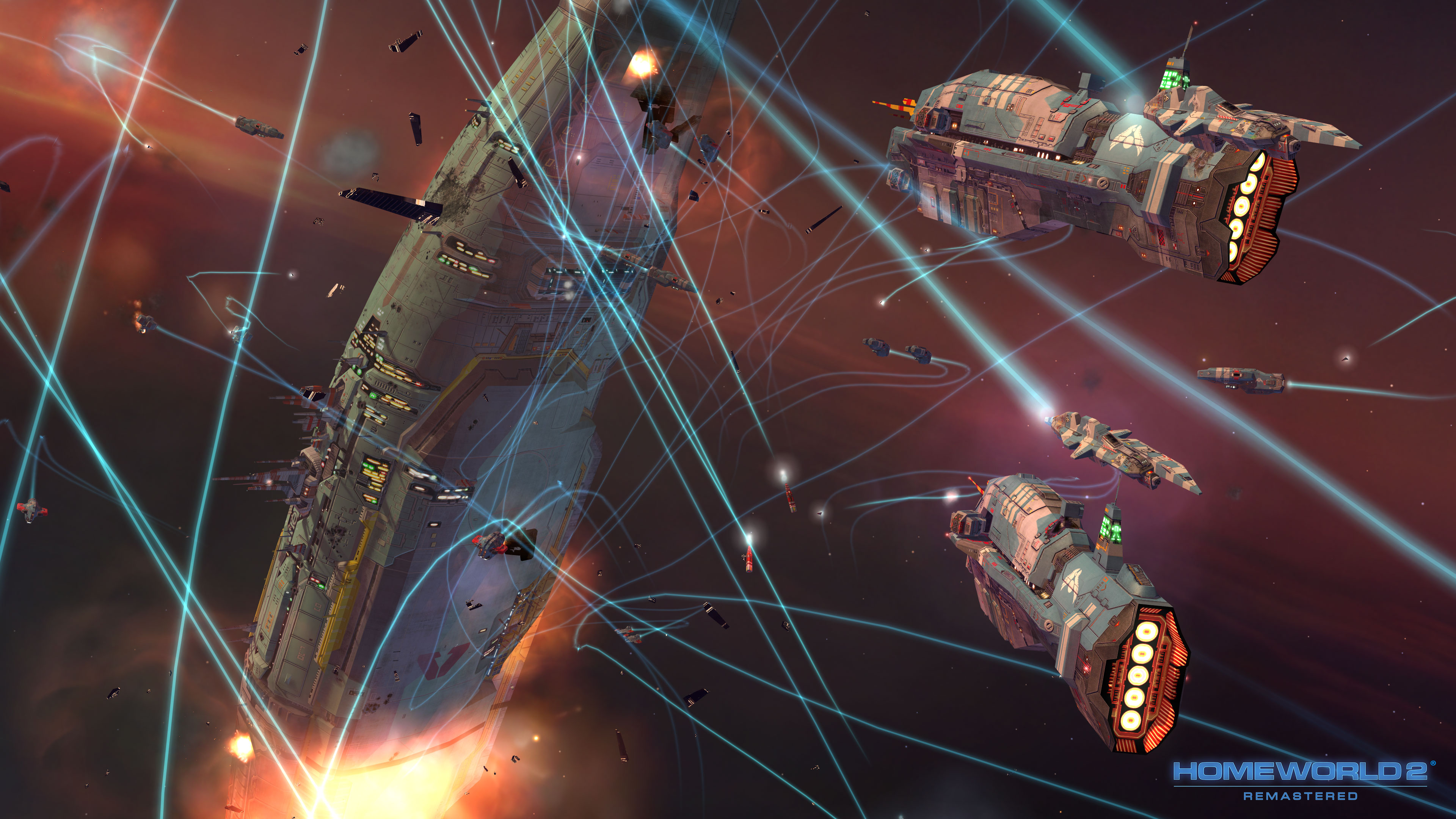


And definitely an impressive remastering:


A lot of what they're doing is stuff I had been thinking of, although they went a bit fully cel-shaded with some borders there in some cases, perhaps.  Anyhow, that general style is something that I think would work well for this game, too.

No doubt you don't need to hear it from me again, but I'll say it anyway, since 99% of AI War 2 is gonna be combat, combat is what has to look the most awesome of all. Doesn't matter how anything else looks, as long as combat has some visual oomph...

The core game mechanic is war. It has to look as awesome as possible, that's the main game feedback loop. Need the right look and the sound variation to back it up.

Right, exactly.  We've learned a ton on sound any of our games prior to Raptor, honestly, so there's a lot we plan on doing with that.

Regarding the visuals of the combat, I have a million awesome tools with the upgraded particle system here, and I'm excited to use them.  I'm not worried about that bit, it just takes time and fiddling to get the optimal performance out of it.

Regarding ship graphics, which really is the meat of the game, there's the far-zoom and the zoomed-in bits, and to me that's what has to look super awesome.  More time is spent in far zoom mode, so that has to get a whole lot of love.

Actually, a lot of time is spent staring at the space backgrounds and the planet and the GUI, so those need the same amount of love.

With sprites that pretty, why are we bothering with ultra-close-zoom 3D models again?  I hardly ever zoom in close enough to see the 'actual models' in AI War Classic; the sprites pretty much ARE the ships as far as I'm concerned.

Because sex sells?   ;)

More seriously, there's a lot of stuff that we can do with the 3D stuff that we can't do with the sprites.  We can do various animations and rotations and so on that you won't see on the distant sprites.  We can represent really huge structures.  We can do cinematic-ish effects.  And so on.

Plus it's fun, we're good at it, and that's not remotely where the bulk of the time or cost on the project goes.  The 3D models will be the quicker-to-create side of things compared to the GUI and far zoom ships, I feel pretty confident.  But those are also the pieces that help to sell the game the most, I think.
Have ideas or bug reports for one of our games?  Mantis for Suggestions and Bug Reports. Thanks for helping to make our games better!

Offline Cyborg

  • Master Member Mark III
  • *****
  • Posts: 1,957
Re: First art look: Buzzing Bees! Those are icons!?
« Reply #23 on: September 13, 2016, 06:35:46 pm »
Is it possible to do a smoke effect with some kind of alpha layering without a huge performance hit?
Kahuna strategy guide:
http://www.arcengames.com/forums/index.php/topic,13369.0.html

Suggestions, bugs? Don't be lazy, give back:
http://www.arcengames.com/mantisbt/

Planetcracker. Believe it.

The stigma of hunger. http://wayw.re/Vi12BK

Offline kasnavada

  • Hero Member Mark II
  • *****
  • Posts: 986
Re: First art look: Buzzing Bees! Those are icons!?
« Reply #24 on: September 14, 2016, 02:17:31 am »
More seriously, there's a lot of stuff that we can do with the 3D stuff that we can't do with the sprites.  We can do various animations and rotations and so on that you won't see on the distant sprites.  We can represent really huge structures.  We can do cinematic-ish effects.  And so on.

Errr about that part.
Modding would include people doing stuff like revamping the game entirely with star wars sprites & models, star trek, possibly others.

I've got absolutely no clue what tools are used to make 3d models, but I feel that whatever is used in AI War 2 should not be too far from the "standard", whatever that is. Or provide a unity tool to enable adding spites / models (some games do that, but it's somewhat reduced the modding community). Same for the sprite, they're very pretty, but some kind of guide has to be there so it can be applied to "modded" sprites.

Probably, you've already thought about this.

Offline eRe4s3r

  • Core Member Mark II
  • *****
  • Posts: 2,825
Re: First art look: Buzzing Bees! Those are icons!?
« Reply #25 on: September 15, 2016, 01:51:12 am »
Yeah adding models as modder to Unity games is a huge pain by the way.. ;)
Proud member of the Initiative for Bigger Weapons EV. - Bringer of Additive Blended Doom - Vote for Lore, get free cookie

Offline motai

  • Jr. Member
  • **
  • Posts: 52
Re: First art look: Buzzing Bees! Those are icons!?
« Reply #26 on: September 15, 2016, 07:45:44 am »
had a thought. with you switching the command color to a backdrop. is it possible to make the command color change the engine glow color instead? i dont know about the trails ships may be leaving while they move but this would seem like the ideal place to make the movement mode color shine through. a 2-3 frame engine glow trail in motion would illustrate command colors brilliantly and if enigne glow is slightly larger than the ship, which it would need to be to be visible,it would still be visible if less prominent in fleets idlin around. also ti seems like the current group structure of squads would mean more idle movement for the color to leak with.