After thinking about it for a while, the giant unlockables list could use a little more interactivity. The main problem is that as unlockables are added to the game, the amount of pages could get enormous.
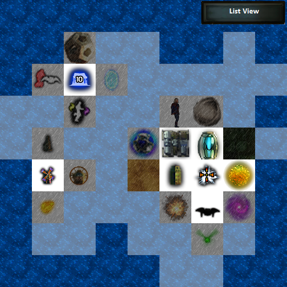
To add a little fun to the unlockables list, I made some mockups of an alternative.

I made a quick image of what I have proposed. Each unlockable that was unlocked would highlight the adjacent 4 tiles. It would allow the devs to give some guidance via a subtle path to follow for newcomers also. An option to show the normal list view should be kept for legacy's sake.

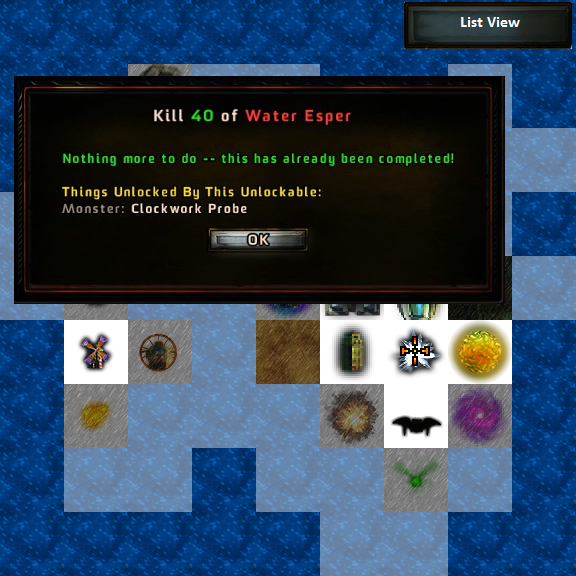
Clicking on any visible tile would give details about the current unlock's status.
Note: I used dark ocean water to represent that no unlock will ever be revealed on the tile and light water to show that the unlock hasn't been shown yet.
I would like to hear any thoughts on something like this. It's a very rough idea so I didn't submit it to the mantis yet.
Also, please ignore the wrong image used for the water esper. 