Author Topic: A Valley Without Wind Pre-Alpha #10 -- Overworld Maps, Soft Focus, and NPCs  (Read 23399 times)

Offline x4000

  • Chris McElligott Park, Arcen Founder and Lead Dev
  • Arcen Staff
  • Zenith Council Member Mark III
  • *****
  • Posts: 31,651
Original: http://christophermpark.blogspot.com/2011/05/valley-without-wind-pre-alpha-10.html

It's been a busy two weeks!  This is the game at 14 weeks of development.  The new screenshots are on the official AVWW page, and here's the new video:


Here's a quick rundown of what is new since update #9, followed at the  bottom by a few longer explanations of some of the items (overworld maps  and soft focus in particular):

The Executive Summary
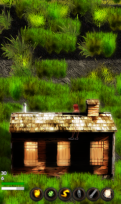

The most visually apparent change is the new soft focus style around the entire game.  It makes our colors more saturated and dramatic, it ties all the elements together, and it's really a big improvement.

We've also hugely redone the way that overworld sections work, and it's way more varied and interesting now -- marrying some procedural techniques with some aspects of hand-crafting.

And last but definitely not least, we've put in a ton of work on crafting, NPCs, settlements, and more -- all that "what is my motivation for playing this" sort of stuff, versus the mechanics of how to play.

Overworld Map Changes

* We now have a map editor,  which is a standalone .NET 2.0 program.  It's got a variety of  functionality for drawing, filling, smoothing, and so forth.

*  Overworld chunks now use heavily-randomized maps to generate a  structure  of obstacles, entrances, lost-in-windstorm points, and open paths.   This marries designer creativity with procedural processing, resulting  in thousands of possible obstacle setups per individual map; and when  combined with the existing randomization and chunk scripts for  populating outdoor areas, the possibilities are multiplied even further.

* We now have three maps in six variants, four done by myself and  two done by Erik.  This already creates a huge variety, but there's much  more to come!  Some are very open, and others are more closed and  twisty at the moment.

* All of the overworld chunks are now 256x256 in size (many of them  were previously 128x128).  This is fourfold increase in size, making  each tile on the world map something like 2/3 the size of the the entire  Zelda 1 world map.  The maps that are applied also now make them vastly  more twisty, which makes them feel even larger.

* The Ice Age (thawing and regular) now are the first regions to  include new "Point of Interest" scripts, which define certain unusual  landmarks that are not centered around a building.  Very little has been  done with this so far, but a lot more will be in the coming months.

* Having a sky visible over the top of a cliff used to be something  that was more limited and which was built into the chunk script itself,  but now it's randomized by region type and these can appear at any  time.  This makes for less duplication of chunk scripts while still  providing more variety.  These also dynamically combine themselves with  the overworld maps, making for even more variance.

New Entities And Background Tiles, Etc

* We now have both flowing water and flowing lava in many chunks (lava  only in the lava flats, and with three different visuals possible all in  one chunk), and these are presently always bordered by one of six  different kinds of sedges (plants) for water, and one type of  burnt-sedge for the lava.

* We now have a new shadbush obstacle type that is used in places like the woods and small towns.

*  We now have a new winter mahonia type of reed, which is dramatic bright  red and now used in the ice age in some circumstances around buildings.

* Added in a new Weed Patch type of plant, which is a tall and  imposing sort of armpit-level undergrowth that you can walk through.   Presently this is limited to Small Town areas; some are absolutely  plastered with it, while others just have a few spots of weeds here and  there.  It really differentiates them more from other areas now.

* Added two plum trees and one walnut tree, which can be seen in the  various grasslands areas (walnut trees mainly in the  grasslands-with-tree-clumps regions).

* Added about sixteen new  vehicles (including new ice age futuristic cars), including many more  that are broken, flipped over, etc.

* Added three new "factory stacks," and some concrete barriers, that  currently show up in the junkyard and later will be used elsewhere.

* There is now a second type of sky, in addition to the one we've had since the first developer diary!

* Added in a higher-level new The Deep region, which is an evil  place filled with pulsing darkness.  We're not going to be showing  screens or video of this, players will have to find them in-game on  their own!

* There are now chasms, rocks, and large birch bushes that work as  obstacles on the world maps in addition to the aforementioned lava and  water.  The south, east and west sides of the chasms aren't completely  polished yet, but they're getting there.  Most of the angles and the  north are the way I want.

* There are now shortswords, broadswords, and rapiers in addition to  longswords, and they all handle a bit differently (stabbing versus  slashing, speeds, powers, etc).

* Three massive new ice age fossils are now seeded as occasional "points  of interest" in the ice age regions.  These are a good example of  something that is interesting but which isn't a building, which serves  as an anchor point on the map. 

Minimap Improvements

*  Dropped item bags (that a player intentionally put down, or dropped  when they died) now show up as a blinking orange blip on the minimap, so  that they can actually be found again in the middle of large chunks.

* The minimap now shows obstacles as dark tiles, aiding in actually  finding your way around.  Additionally, trees, hatches to the  underground, vehicles, shipping containers,and roads all show up as a  middle-dark color, adding extra shaping and information to the minimap.   All of this is only shown in parts of the chunk where you've actually  found the Point of Interest that reveals that section, of course.

* There are now three sizes of minimap that can be toggled through  using the M key (128, 176, and 256).  128 is the old size, and 176 is  the new default.  Personally, on my really large screen I really like  the largest minimap size.  It's really easy to see a ton of detail even  in giant outdoor chunks on it, now.

* The player dots on the minimap now blink between a larger state and a smaller one, making them MUCH easier to see and find.

*  Entrances are now shown in the minimap, instead of explored points of  interest (which are mostly pointless to show, anyway).  The entrances  are now shown in full red, rather than light red, so that they are much  more visible, as well.

* The region level is now shown in the in-game hud (that's pretty important info!).

Settlements And NPCs

* Settlements are now a part of the game, which is a huge step forward, although they are fairly simplistic so far.

*  NPCs who live in settlements can ask you to forge a safe path (using  wind shelters) between their settlement and another nearby settlement.

* NPCs can now ask you to clear the area of monster nests to protect  the settlement they live in, in order to gain more trust for them.

*  NPCs can now ask you to explore nearby regions to their settlement,  providing them with some degree of protection from the unknown.

* NPCs can now ask you for a certain quantity of an item (which if  you don't give them, they probably will eventually get on their own,  anyway).

* NPCs in general now have an underlying system of hopes  and needs, and they have intermediate goals along the path to their  hopes.  These are things that can be accelerated by your intervention,  but many of these are also things that the NPCs will eventually solve on  their own without your help.  So you can help out where you want,  without being forced to babysit a guy who wants to be a better  blacksmith or whatever, if you don't particularly care about his  smithing ability.  But if it's useful to you, you can help him along  much faster!

* Characters now have crafting profession tiers, and get more  proficient with crafting through various means (as hinted at, above).

*  NPCs are now able to migrate from one chunk to another, useful for when  they agree to migrate to a settlement (which you can now do, in a  testing sort of fashion that's the basic framework for what we later  have planned).  They do this only after you've also left the chunk they  are in.

* A lot more internal work on the state of NPCs in general is now in place.

*  NPCs can now have various personality traits that affect their hopes  and needs, such as professional pride and protective, as the two we're  currently working on.

* NPCs now have an interest in actually building up their settlements, and there are now those with a Builder interest that build small homes and bunkhouses for other NPCs to live in.

Crafting

* There are now a variety of metal and crystal material types, all used for crafting different kinds of weapons and equipment.

*  All of the various spells and equipment items now have some sort of  crafting recipe that can create them.  And in the case of physical  weapons like swords, etc, those have multiple metal tiers at which they  can be crafted in.

Gameplay

* There are some "monster nests" that can now be found around the world, and which spawn monsters.

* It is now possible to Wait on the world map, advancing the  windstorm counter by one, rather than having the only way the windstorm  counter decrements be to move.

* Added a new Light Snake ability  to the third ability bar.  It replaces the idea of the light tracer,  this time with a slower, snake-like stream of particles that move past  obstacles and then clump somewhere.  The snake lasts for 10 seconds and  casts quite a lot of light as it moves.  It has a very long logistical  recharge time of 15 seconds, though, as its main cost.

* More work on the melee weapons and effects, but it's not quite  there yet.  We are now planning all manipulation of swords and such to  be telekinesis-based, which we have some cool effects for, but it's only  partially implemented.

* The system for cooldowns has been made vastly more robust, and now  prevents things like spamming the healing while also mashing the attack  buttons.  You have to actually be strategic and thoughtful with things,  now!

Visual

* Pretty much ALL of the in-game graphics have been post-processed with a  new Soft Focus effect that makes the entire game have a super  attractive (to us, anyway) stylized color that also is much more cohesive.  Boy is this a big difference all throughout the game.

* Graphics for the twigs in the lava flats have been replaced with vastly nicer-looking burnt-bushes.

* The lava clouds in the lava flats area are only half as intense as  they were before, aiding visibility and making it look nicer in general.

* The visuals for roads have been upgraded somewhat.

*  The way that bushes at the edge of cliffs are done has now been  completely changed -- they are no longer immobile, and are now glowy and  evil looking (what I'll call "The Deep" look).  I'd always intended for  it to be the case where the earth was pulled down into a supermassive  chasm where the sky is visible, partly by the force of evil plants, and  now they look it. :)

* There's a very cool new heal visual effect.

* Lots and lots of spell effects have been rendered out, although they haven't been coded in yet.  Coming soon! :)

* The new lighting model now has dimness in the center eyesight  areas,  like the simple eyesight model does.  I had thought it couldn't  be  done, but it turns out it sure could!  It's quite a big improvement,  as  players had suggested it would be. :)

* Also visuals for several new kinds of enemies that we haven't had time  to actually add to the game yet (giant amoeba, etc), but which look  cool.  Also coming soon! :)

* The player ghost and player bones states now have an animated "spirit fire" effect.
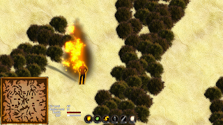
* Characters now glow with a color that is relevant to their spell as they cast spells.

* Finally got around to updating the remaining world map icons that were still painterly.

* There are some other new ground backgrounds, such as the pine needles in the evergreen forest areas.

* Espers are now ghostly white.

* Player characters, NPCs, player bags, and dropped items all now have a new ShouldRenderOverlay property set on them, which makes it so that their outline is always drawn on top of themselves (using the new HardOutline), which gets drawn after basically everything else in the game.  This makes it so that you can still see the outlines of these things from behind solid objects, grass, or whatever else.** The MustBeVisible property has been taken off these objects, and the Sparkle ongoingcondition is now gone from the droppeditem object.** I'm undecided on whether to always have this be on for player characters or not, as it can be a bit annoying/disconcerting in grass or shadows, but for dropped items this is definitely the way to go instead of the sparkle -- and at worst I would relegate this to a settings option, since some players have specifically asked for it.

Non-Visual

*  Improved the AI for wandering enemies such that if they are stuck at a  specific point for more than a quarter of a second, they'll choose  somewhere  else to go.

* Several performance improvements have been made; it was already a  really high-performance game, but this fixes some relative slowdowns  with high-grass areas and with chunk-gen.

* Lots and lots of name  files have been prepared by Erik, ready and waiting for new character  sprites of different genders, ethnicities, and time periods.

* World files are now compressed to disk in a very CPU/RAM friendly  way that shrinks each chunk down from 1.8mb to about 22kb, on average.

* Plenty more music and sound work, as usual!  In particular there's been a big batch of sound effects this time around.

Continued below...
Have ideas or bug reports for one of our games?  Mantis for Suggestions and Bug Reports. Thanks for helping to make our games better!

Offline x4000

  • Chris McElligott Park, Arcen Founder and Lead Dev
  • Arcen Staff
  • Zenith Council Member Mark III
  • *****
  • Posts: 31,651
More About Soft Focus

All  along I've been trying of course to make a unified visual style for the  game, and the chief way that I've been doing that has been with the  painterly style on all the sprites.  That works very well, but that's detail work  and only shows up in full-size screenshots or really uber-detailed  video of the sort that youtube doesn't really do.  Or any other  streaming service.

What that has left us with is something that doesn't really reduce  well at all, and my main way of trying to combat that was with special  effects.  Again, that was working pretty well, and certainly explosions  and fireballs draw the eye.  But we can't have those in every last  screenshot, and it doesn't really help with the overall perception that  the art just looks kind of cheap.

This is ironic because, even though the art is actually commodity  models rather than custom ones, it's the sort of models that are  unsuitable for games because their polygon counts are too high -- they  have above average detailing, higher than something like Crysis, even,  in many cases.  The state of raytraced modeling in non-realtime formats  is just lightyears beyond anything that can be done in realtime raster  formats (aka games), and that's something I thought I was taking  advantage of pretty well -- but again, it doesn't reduce well, and  everything in the game is pretty small despite being a lot more HD-sized  than most other games out there that are sprite based.

So I had been thinking about about two weeks ago, and I was looking at the latest raytraced art by one of our community members  (eRe4s3r), and I was for the jillionth time thinking how annoying it  was that since I'm rendering all these objects into sprites, I lose a  lot of the advantages of raytraced art such as having cross-object  dramatic lighting, ambient occlusion, and so forth.  A lot of those  effects are what really make eRe4s3r's images "pop."

And that's when it hit me: in a macro sense, it's not so much the fancy effects, as it  is what it does to the color value of the image, and how that color  interacts with nearby objects.  What makes that image so darn  attractive, even when it's tiny, is that the colors are really stylized  and over-dramatic and saturated.  I'd originally been going with a  down-saturation look  for AVWW, thinking of Silent Hill mostly, but that  was a big mistake as it just makes things look bland.  Silent Hill is  an awesome game, but it looks bland -- that's part of what makes it feel gritty and scary.  But that only works in true 3D, I think.  Bad role model.

Anyway, long story short, what I've wound up doing is basically doing a "soft focus"  effect on all the sprites, which accomplishes two things.  First,  within each sprite it adjusts the colors so that they are over-dramatic  and heavily stylized, while still keeping the underlying shape and brush  strokes.  In the case of some of them, it makes them overly dark  shapes, but that sort of contrast and attention to overall form rather  than detail actually serves the game well, I think.  That can't be every  object, but it works well when it's about 10% of them.  Secondly, it  also applies a bit of a Gaussian blur haze around each object, such that  it almost seems to "bounce" its color to nearby objects -- mimicking  ambient occlusion without actually using it (since we can't in any  realtime game prior to DX11, and that's only for basically Crysis,  anyway).  This helps to tie each object to its surroundings a bit better  than before, which is something I'd really been struggling with for the  buildings in particular.

All in all, this creates a style that minimizes better, in some cases much better,  aside from looking much better full-size.  The colors are more  attractive and vibrant, and the overall style of color hues has more in  common with games like Bioshock and Crysis than they do with any 2D  games I can think of.  I was also inspired some by the Death Rally  remake on iPhone, the screenshots of which really make me salivate.  In some respects, this new style is a bit over the top and  surreal, sort of like the Twilight sections of Zelda: Twilight Princess.

So this is a real departure in overall visual tone and look, but the staff has been really excited about it, which bodes well.  And personally it's the sort of  thing that I'm just gaga over, I just can't get enough of colors like  that!

More About Overworld Maps

Previously, an individual chunk only had two levels of detailing: it had a general "chunk script" that it would follow, which is a dynamic very-broad-recipe for chunks that players can create and which we also create; and it had sub-scripts for creating buildings and seeding stuff around them.

This was okay, but it tended to lead to chunks that felt big and empty.  Really, they also felt smaller than they were, because the shortest path between two points was always basically a line.  It wasn't a very creative use of the outdoor space (but hey, that hadn't originally been planned to be the end state for outdoors areas, anyway).

Now what we've added in is a third layer of detailing, with a fourth coming soon.  The third layer is the overworld maps, while the upcoming fourth will be the "points of interest seeding" that I talked briefly about above.  More on that in another week.  The overworld maps alone create a massive change to the feel of the overworld areas, making for blockages and dead-ends and paths you have to explore to find your way through.

For instance, it's possible to have an area on the screen that you can't get to without finding a long way around, which is new for this game (not that new in adventure games overall, of course).  Now it's also possible that there are only 1-4 exits from a given chunk to the overworld, so when you get lost in a windstorm you might be really lost; it's no longer a simple matter of walking in any direction and living until you escape.

Here are some examples of how a single map from the map editor can vary in even the broadest senses:
There are four examples each of the Slashes and Vines map types, and three of the Tiger Stripes map type.

Most of the dark areas on the map are obstacles like water, lava, rocks, chasms, or bushes -- that is randomized and you can't tell from just the minimap -- but some of the big areas that are completely blocked are actually sections that are completely surrounded by such obstacles, and which are thus inaccessible to the player.  These sections won't have any buildings or anything else useful in them, and so the player doesn't lose anything by not being able to get into them.

Another thing you'll notice is that along the top of some of these maps there is a "hairy" line -- Slashes 2-3, Tiger Stripes 1-3, and Vines 3-4.  Those are actually cliff edges to open sky, with the evil black plant tendrils being the hairy lines in question.  Those open sky areas were not defined in the map editor, but get seeded in randomly depending on the type of region the map is being used in (a lot of things vary by the region, such as even what sort of obstacles are employed, and a single map could be used in many regions).  All of these minimaps are from thawing ice age plains, which has a very high chance of open sky cliffs, which is why you see so many of these having them.

You'll also notice that some of these are very open, and others are very closed.  Slashes 3-4, Tiger Stripes 2, and Vines 1-4 all are the closed variants of themselves.  In these closed versions, there is a 50% chance of having only a single exit from the entire chunk, and a 50% chance of having 2-4 exits.  There is only ever one entrance to an outdoor chunk, period -- you always come in the same way.  But whether that is the only way out, or whether there are a few other exits, is the question.  Of course, in the Open versions of the maps, there are quite a few ways out of the chunk.

All of that was just speaking to the very broadest level of description about the chunk -- the new overworld maps.  Then of course the pre-existing two layers, the chunk scripts and the sub-scripts, kick in.  That's where you see all those little details on the minimaps: the little rectangles with red dots are all buildings of some sort, and you can see how widely they vary in their position.  The little white dots are all monster spawners.  And the various lighter gray shapes are things like trees, vehicles, and other destructible obstacles.  If there were any roads in these sections (which there aren't), you'd also see those in light gray like that.

So.  As you can see, there's now a much larger amount of variance in how the surface regions get constructed.  All of these are just from three maps alone, all in a single chunk with just I believe one chunk script and maybe two sub-chunk scripts.  That's a huge amount of variance from relatively few inputs, because each type of input is so randomized in and of itself.  And as we -- and players! -- add more and more inputs -- more chunk scripts, more sub-scripts, more maps, and the upcoming "points of interest" scripts -- the amount of variance is just going to skyrocket even further.  This is a good example of the power of combining hand-crafting techniques with multi-layered procedural techniques!

More About Surface Region Sizes

In the past, most of our chunks were sized at 128x128 tiles.  Each tile is 64px square.  The various "hostile" chunks were sized at 256x256, however, to make it harder to quickly escape from them when you could just run in a straight line to get out from any side.

Now, of course, the chunks are twisty and sometimes labyrinthine, so it's always slower to escape from them, anyway.  So did we shrink the hostile chunks?

Of course not!  We instead increased the size of all the outdoor chunks to 256x256, making that our new standard.  The primary reason for this is space for buildings -- I was finding that in maps with any degree of twisty passes, there just wasn't enough room to have buildings in unpredictable locations.  You'd wind up with the buildings always clustering on the right, or whatever, which made the maps not seem very varied.

Bumping the map size up 4x, from 128 to 256 squared, solved that problem really nicely, as you can see from the example minimaps above (as well as the minimaps in the video).  This means that all of the non-hostile outdoor areas are now nominally four times larger in area, but really the feel of it is that they are 10x larger or something along those lines.

The reason is simple pathing: before, to get from point A to point B, it was always a line you'd walk in, except to go slightly off the line to go around trees or buildings.  Now it's sometimes a very complex and maze-like situation to get from point A to point B, which means that the distance you have to travel to get from point A to point B might be much further and more interesting.

None of that is exactly ground-breaking for adventure games, as they all use the same techniques in terms of breaking up the landscape.  All the way back to Zelda 1, you see that sort of pattern.  But it's new to this game this week, and it's really interesting to me to see how much that one simple change really transforms the entire feel of playing the game.

Speaking of Zelda 1, there are some interesting size comparisons to be made.  Zelda 1 had 8x8 pixel tiles on each screen, and each screen was 32x22 tiles in size.  So that's 704 tiles per screen.  AVWW has 64x64 pixel tiles, and a 1280x1024 screen can show 20x16 tiles at once.  So that's 320 tiles on the screen at once -- there's a lot more detailing on each tile, obviously, given that each of our tiles has sixty four times as many pixels as a Zelda 1 tile (8x8 = 64, 64x64 = 4096).

So in some senses it is a little more "zoomed in," but you're also getting a lot more detailing on each tile.  It's interesting to note that the beloved Zelda: Link to the Past made the same decision: it moved to a 16x16 tile size, four times larger than that of Zelda 1, and it could show 16x14 tiles on-screen at once (the SNES output resolution was 256x224).  That's equivalent to playing AVWW at 1024x896, which is still plenty zoomed out for both AVWW and Zelda 3.

Okay, enough about screen resolutions -- let's talk about map size, which is actually a lot more interesting.  So, Zelda 1 had 704 tiles per screen.  The entire Zelda 1 overworld was made up of 16x8 screens, so that's 90,112 tiles in the entire Zelda 1 overworld.  Since the AVWW surface chunks are now 256x256, that's a total of...65,536 tiles in a single surface region of AVWW.  Note that each tile on the world map of AVWW is a region.  So by the time you've traversed two of those regions, that's more surface area than the entire Zelda 1 overworld.

To those who had worried that the surface chunks seemed a bit on the small size (at 128x128, that would have been 16,384 tiles per chunk), that's definitely no longer the case!  Not only are the chunks now more twisty and interesting in their shapes, they are also now larger and have more stuff in them.  And we're only going to be packing in more and more stuff per chunk, too, which is a big part of what's coming up for us in the next few months.

Until Next Time!

Lots more coming down the pipe soon, as always.  Keith is hard at work on NPCs, settlements, and that sort of thing.  I'm doing more stuff with chunks and seeding, and then moving into underground areas and interiors again, as well as some more spells and art stuff.  Pablo is hard at work as always on music and sound.  And Erik is working on more maps, "wiring up" new objects that I do the art for, more randomized names for things, and so on.  Stay tuned!
Have ideas or bug reports for one of our games?  Mantis for Suggestions and Bug Reports. Thanks for helping to make our games better!

Offline Ozymandiaz

  • Hero Member Mark II
  • *****
  • Posts: 813
  • King of kings
Looking good! :)

Still not read it all yet, but I will ;)
We are the architects of our own existence

Offline x4000

  • Chris McElligott Park, Arcen Founder and Lead Dev
  • Arcen Staff
  • Zenith Council Member Mark III
  • *****
  • Posts: 31,651
Yeah, it's a long one this time. :)
Have ideas or bug reports for one of our games?  Mantis for Suggestions and Bug Reports. Thanks for helping to make our games better!

Offline Zhaine

  • Jr. Member Mark II
  • **
  • Posts: 85
Wow, what a host of improvements. Work progressing at quite a pace it seems!

Glad you went with the object outlines when they're obscured :)

The giant skeleton was. . . awesome. And unexpected :p

Keep up the good work

Offline snrub_guy

  • Full Member Mark II
  • ***
  • Posts: 160
I truly believe that there are not enough colourful games made at the moment, so the shift there seems like a nice one!

The rest all looks good- though one thing I wondered is that you said areas always have only 1 entrance. Is this for any particular reason? Would it not make sense to come in from the direction you entered the area from? Say I'm travelling south, wouldn't it be logical that I appear in the north of the next area? Or at least the entrance that is closest to the north? It's just a little query that came to me.

Awesome work guys.

Offline Flatfingers

  • Newbie Mark III
  • *
  • Posts: 43
Wow, indeed -- outstanding productivity!

All the latest improvements sound great. I'm not an artist or a Zelda player, so I'll leave questions about those aspects to others. There are some other things I'm now very curious about given these latest feature tidbits, though:

Personality Traits -- I'm really looking forward to seeing this, especially along with the hopes/goals internal motivation system. In addition to those already mentioned, I can imagine:

  • satisfaction/curiosity
  • xenophobia/xenophilia
  • pacifism/violence
  • energetic/observant
  • technological/magical
  • consensual/hierarchical

(This assumes that personality traits are two-valued, and not just standalone traits.)

Crafting:

  • Will source resources have different properties, and if so will the resource properties affect to some amount the characteristics of the crafted item?
  • Will crafted items be unique, or will most items of the same type be identical?
  • What will the process of crafting something feel like? Will it be a simple one-step action, or can it be a sequence of steps that benefit from knowledge and planning?

Economy:

  • Will the faucet/drain model be used? Or something more complex?
  • Actually, a more fundamental question might be whether AVWW will have a money economy anywhere or pure barter everywhere?

Every new piece of info generates more questions, of course.  ;D

Offline c4sc4

  • Sr. Member
  • ****
  • Posts: 253
Wow, large update. I'm excited to hear more about the settlements.

Quote
* World files are now compressed to disk in a very CPU/RAM friendly way that shrinks each chunk down from 1.8mb to about 22kb, on average.
That's, um, dramatic.

Offline x4000

  • Chris McElligott Park, Arcen Founder and Lead Dev
  • Arcen Staff
  • Zenith Council Member Mark III
  • *****
  • Posts: 31,651
Thanks, all!  Glad it's a hit. :)

Glad you went with the object outlines when they're obscured :)

Personally I really don't think it's needed in practice, but it's a clever bit of technical work to make it happen, which I'm proud of -- and enough people wanted it that I figured that would be helpful.  I have it so that the outline actual fades in and out once a second or so, so it's not too obnoxious. :)

The giant skeleton was. . . awesome. And unexpected :p

I've been planning that for a while, but haven't had a chance to add it in until now. That's just the first of many various kinds of "flavor objects" that will be coming. :)

I truly believe that there are not enough colourful games made at the moment, so the shift there seems like a nice one!

Yeah, there's quite a lot of muted browns and grays games.  I like that sort of thing, but it's definitely overdone!

The rest all looks good- though one thing I wondered is that you said areas always have only 1 entrance. Is this for any particular reason? Would it not make sense to come in from the direction you entered the area from? Say I'm travelling south, wouldn't it be logical that I appear in the north of the next area? Or at least the entrance that is closest to the north? It's just a little query that came to me.

Well, originally I was going to have it do just that, with you appearing in different ways depending on what direction you're coming from.  But that's not really always possible, because sometimes an entire side that you'd be coming from is blocked (like often the north, when it's the cliffs there).  And more to the point, that really just introduces a feeling of inconsistency. 

Whenever I think about the games I love that have world maps (FF6, Chrono Trigger, FF7, etc), it occurs to me that you always enter each place from the same location.  There's only one way into Narshe or the Denadoro Mountains, etc.  Even something like South Figaro that you can approach from any direction only has one place you always come in.  It's an abstraction, sure, but I think that having a consistent way to get into a locale is a good thing -- when I go into a map tile that I've been to before, it's always exactly predictable where I will appear in that chunk (windstorms notwithstanding), which is something I like.

Personality Traits -- I'm really looking forward to seeing this, especially along with the hopes/goals internal motivation system. In addition to those already mentioned, I can imagine:

  • satisfaction/curiosity
  • xenophobia/xenophilia
  • pacifism/violence
  • energetic/observant
  • technological/magical
  • consensual/hierarchical

(This assumes that personality traits are two-valued, and not just standalone traits.)

All of this is in Keith's court at the moment, so I can't really speak to that.  It's a highly iterative process that he's going through, and I'm mostly keeping out of it because I'm so busy with the parts I'm working on.  In terms of personality traits that we're planning, from what I understand most of them will be centered around either goal-creation or dialogue, or both.  So if someone hates robots and you're playing as a robot, they will have hostile dialogue to you.  If they want to improve at their profession, they will have personal goals related to that; if they want to protect their settlement, they'll have goals related to that.  I guess if they are lonely, they would have goals relating to finding a mate, or something.

To be honest, I'm not sure where it's going to go, and I don't think Keith is positive, either.  Right now it's basically exploring what is most concrete while trying to keep things really flexible for future expansion, and seeing what feels right/fun.  We're really not trying to build a true sim here, is one important thing to bear in mind -- it's all about what this changes for the player.  So any traits we have need to manifest somehow in ways that are relevant to the player (visible behavior of the NPCs or new goals/options for the player being the only two kinds of manifestation I can really think of).  Anyway, it's just the tip of the iceberg so far, but Keith is basically devoting all his time at the moment to the NPC systems, which I'm really pleased that we're able to do. :)

What will the process of crafting something feel like? Will it be a simple one-step action, or can it be a sequence of steps that benefit from knowledge and planning?

I'll answer this one first, because it speaks to the others.  To craft something, you just open up the crafting menu for that type of profession (say, Weaponsmith), and then you have a list of the materials that you currently have in your inventory.  So if you have, say, Bronze and Silver, that's all you see in the list there.  When you select Bronze, you see a list of all the recipes that include bronze.  Any of them that you have all the components for show up as active, the rest are grayed out.  You can see what will be produced as you scroll past each one, and when you see one that you like and that you have all the materials for, you can simply press the Confirm key on that item, and it gets created -- that's it.

So there's not any sort of skill or dexterity to the crafting; it's not a minigame or a puzzle.  However, what there IS, in great abundance, is choice.  In Minecraft, to pick one example, there's only a few things you can do with redstone dust.  They are useful and fun things, but it's only five or six options (of course, the strength of Minecraft being that once you craft one of those five or six things, they can be used in endless inventive ways). 

In AVWW, a hunk of bronze could be useful for traps, for weapons, armor, crests, and so on.  A ruby gemstone could be useful for crafting spell gems that cast a fireball, or it could be used as part of a trap, weapon, or crest to give it some sort of fire-related properties.  It can also be combined with certain other gemstones to create some things that are only tangentially fire-related (such as some of the stuff that has both properties of fire and light, and so uses ruby and quartz).

Will source resources have different properties, and if so will the resource properties affect to some amount the characteristics of the crafted item?

Yes, many of the resources are basically tied to an ability.  Rubies have fire-related effects.  Quartz is related to light.  Other materials would lead to homing spells when combined with spells that don't normally have homing, and things of that nature.

Will crafted items be unique, or will most items of the same type be identical?

Well... it depends on what you mean, really.  An iron rapier is an iron rapier and that's pretty much it.  However, that would be just the most basic recipe.  There would also be recipes for an iron rapier with slots, or possibly with something like a fire gem inside it or something.  And when you put crests or spell gems into slots, then you get other combinatorial effects such as a rapier with a speed crest to swing faster, or a fire gem to have fireballs shoot out when you swing it.  Or both, if there are multiple slots in there.

Given the same recipe and the same stuff put in your slots, you'll always get exactly the same result.  There's not any sort of random rolling of stats or something.  But our goal is to make it so that there are so many recipes that you have a real buffet of choice with any given thing.  Early in the game there are no slots at all, and so things tend to be more generic then while you're still just getting used to everything.  Then you start getting one slot on items, then two slots per item, and maybe more than that much later on (not sure yet on that).  And that's where you can get into some interesting stats-augmenting, which is basically what the slots are all about.  But unlike the core crafting system, the slots aren't currently planned to be irreversible (so you can make a speed-fireball iron rapier, and later change it to something like a strength-strength iron rapier or whatever).

Will the faucet/drain model be used? Or something more complex?

I'm not sure what you're referring to, actually, but we aren't planning to have an economy.  In no way is this a true sim game; this is an action-adventure game.  So the various materials and such are only a simulation of a simulation (both for the sake of lowering CPU load, and because we simply don't care about that aspect).  So it's not Zelda being played inside a SimCity clone, if that makes more sense.

Actually, a more fundamental question might be whether AVWW will have a money economy anywhere or pure barter everywhere?

At present we plan to have no money whatsoever.  Mostly it's not even barter, either -- other characters won't have stuff that you can get from them, and you won't have anything they want most of the time, either.  In specific cases where somebody needs some of X resource, you might happen to have it or you might need to go get it, but that's more of a favor than a barter, because you won't get anything back from them in any direct sort of sense.  Instead, you've just helped them on to their own goals, and you may have improved their attitude toward you in the meantime.

Both of which CAN benefit you in very direct ways.  If they are sufficiently happy with you, then they are more likely to do YOU favors (like crafting stuff, etc), and they're more likely to listen to things like your suggestions that they come to X settlement or whatever.  For people that already like you fine, helping them further their goals quite possibly also helps you: making the settlement more protected might have uses of its own; helping a guy become a better weaponsmith means that he can make better weapons for you as well as anyone else he's making weapons for.  And so on.

This is a post-disaster situation.  I don't know if you've ever been through one of those, but I've been through several -- mainly hurricane and tornado aftermaths, though this has more in common with hurricane aftermaths because those affect everyone.  I've observed that in those situations there's a lot of neighborly help going on.  You have a chainsaw and I don't, so you come over and cut the logs off my driveway so that I can get my car out.  This isn't in exchange for anything, and I'm not obligated to you in any way after that.  You just were helping out because you had a chainsaw and I didn't.  And the power is out inside for everyone, so it's not like any of us have anything else to do, anyway. ;)  But later, it's perfectly natural for me to help me lug tree remains down to the woods if you lost a ton of trees and I didn't.  And so on.

So it's one of those situations like that, where we all have individual interests but are also willing to help one another out.  I wouldn't even call it altruism, it's just how everyone tends to come together in the wake of a disaster.  I'm walking down the street and see somebody I don't know struggling to get debris off their car, and I stop to help because I happen to be there and I have the time.  They'd do the same for me, unless they actively disliked me, were way too busy, were hurt or disabled, or were unusually selfish or whatever.

More or less... this is what we're modeling.  But it's something that is growing and changing, so three months from now that answer might not really be correct or all-encompassing.  I really doubt we'll move to having money, though, because it's simply not that sort of game.  There's not a shop that you can go to to buy... anything.  You have to go out and scavenge or discover everything, but those are also all just raw materials -- you aren't finding guns and swords like in diablo or whatever.  So what we actually have is an expertise trade, where you give me the resources and I give you back a finished good because I'm able to and it's not that much work for me.  Assuming I don't hate you or mistrust you, and I'm not lazy or selfish.

Every new piece of info generates more questions, of course.  ;D

Oh, of course. :)

Quote
* World files are now compressed to disk in a very CPU/RAM friendly way that shrinks each chunk down from 1.8mb to about 22kb, on average.
That's, um, dramatic.

Text files are notable for compressing REALLY well.  And these are just large unicode flat files, basically, so that's why it compresses so well.  It's the same with AI War -- you're always seeing compressed savegames, and most of them are 1-5 MB.  Uncompressed, some of those are over 30mb or even more!
Have ideas or bug reports for one of our games?  Mantis for Suggestions and Bug Reports. Thanks for helping to make our games better!

Offline KingIsaacLinksr

  • Master Member
  • *****
  • Posts: 1,332
  • A Paladin Without A Crusade...
I'm liking the improved art look and that giant skeleton made me go "wow!" and that right there is a win already visually :)

As a long time Zelda fan (I'll bet you couldn't tell ;)) I definitely appreciated the scale of what your doing compared to what they did back then.  So thanks for that. 

I'm liking the general progress your doing so far.  Hopefully I can participate in the BETA, then I give more constructive criticism.  Visuals and such only go so far.  The technical aspects of what your doing are impressive too. 

As the guy above said: Love the colors.  :)

King

Casual reviewer with a sense of justice.
Visit the Arcen Mantis to help: https://www.arcengames.com/mantisbt/
A Paladin's Blog. Long form videogame reviews focusing on mechanics and narrative analyzing. Plus other stuff. www.kingisaaclinksr.com

Offline superking

  • Hero Member Mark III
  • *****
  • Posts: 1,205
looks much nicer!

I still think you should consider making character sprites 8 directional instead of 4, imo it looks off at the moment- especially when the character is running diagonal-down

Offline x4000

  • Chris McElligott Park, Arcen Founder and Lead Dev
  • Arcen Staff
  • Zenith Council Member Mark III
  • *****
  • Posts: 31,651
I still think you should consider making character sprites 8 directional instead of 4, imo it looks off at the moment- especially when the character is running diagonal-down

In some respects it is sort of tempting, but that would be increasing the disk footprint per character by about 1.2mb to do that.  That then causes the game to load the characters slower, it's slower for me to create them, and it's more to download.

Most games I've played didn't have diagonal character sprites -- none of the Zelda Games, not Chrono Trigger, not any of the older Final Fantasy games (though they also didn't have diagonal movement).  With newer games it's really mixed; Across Age does support diagonal sprites, but Zenonia 3 doesn't even support diagonal movement.

So despite what preferences there may be for various individuals with this, I don't think there's a clear edict for this sort of thing.  As with any sort of graphical fidelity thing it is oh-so-tempting to me -- I'd do it all if I could -- but there's also the practical side to consider.
Have ideas or bug reports for one of our games?  Mantis for Suggestions and Bug Reports. Thanks for helping to make our games better!

Offline Echo35

  • Master Member Mark II
  • *****
  • Posts: 1,703
  • More turrets! MORE TURRETS!
In some respects it is sort of tempting, but that would be increasing the disk footprint per character by about 1.2mb to do that.  That then causes the game to load the characters slower, it's slower for me to create them, and it's more to download.

I can definitely understand the extra workload part, but 1.2 MB and additional loading? How big and fast are hard drives these days? :P

Offline x4000

  • Chris McElligott Park, Arcen Founder and Lead Dev
  • Arcen Staff
  • Zenith Council Member Mark III
  • *****
  • Posts: 31,651
In some respects it is sort of tempting, but that would be increasing the disk footprint per character by about 1.2mb to do that.  That then causes the game to load the characters slower, it's slower for me to create them, and it's more to download.

I can definitely understand the extra workload part, but 1.2 MB and additional loading? How big and fast are hard drives these days? :P

1.2mb PER CHARACTER.  So if I hit my goal of 60 characters, that's 70mb of extra space.  Nobody cares on the disk space, but it will make the download size that much larger.  Plus then if I did this for enemies, that could double that 70mb again, potentially.

When you get into loading, it's worse than you think because of a couple of things.  First off, it has to decompress the PNG and make a texture format in-memory representation.  That's fairly trivial, but when you're talking about a lot of characters at once, it can add a few seconds to your load time.  Then there's the new "border behind buildings" thing.  That has to be calculated as the sprite is loaded, at runtime, and that is a much slower process -- adding the extra directions per character might add... I'm not sure, maybe .7 seconds per character in loading time.  That's on my Sandybridge quad, on slower stuff it would be longer because it's a CPU operation not a disk operation.

Are these insurmountable obstacles?  Of course not.  But they are strong disincentives.
Have ideas or bug reports for one of our games?  Mantis for Suggestions and Bug Reports. Thanks for helping to make our games better!

Offline Echo35

  • Master Member Mark II
  • *****
  • Posts: 1,703
  • More turrets! MORE TURRETS!
1.2mb PER CHARACTER.  So if I hit my goal of 60 characters, that's 70mb of extra space.  Nobody cares on the disk space, but it will make the download size that much larger.  Plus then if I did this for enemies, that could double that 70mb again, potentially.

When you get into loading, it's worse than you think because of a couple of things.  First off, it has to decompress the PNG and make a texture format in-memory representation.  That's fairly trivial, but when you're talking about a lot of characters at once, it can add a few seconds to your load time.  Then there's the new "border behind buildings" thing.  That has to be calculated as the sprite is loaded, at runtime, and that is a much slower process -- adding the extra directions per character might add... I'm not sure, maybe .7 seconds per character in loading time.  That's on my Sandybridge quad, on slower stuff it would be longer because it's a CPU operation not a disk operation.

Are these insurmountable obstacles?  Of course not.  But they are strong disincentives.

That makes a lot more sense then. As you say, it's not a big difference for higher end machines (Definitely just downloaded Dragon Age from Steam yesterday. 24 GB download ftw) but on lower end machines I could see the loading being more of an issue.

Also, Sandy Bridge Quad? Don't you mean Octo? :P